website redesign
- Rachelle Vassoler
- Oct 11, 2023
- 4 min read

for this assignment, we were asked to work in groups and redesign a website of our choice while introducing a new concept with a disruptor site. We were to chose a core site we would be redesigning, an analogous site similar to our core, and a disruptor site that posed as an example for our new concept. We chose to redesign Stop and shop with Target as our analogous and Duolingo as our disruptor.
before we decided on Stop and Shop, we created a list of possible redesign ideas:


after making our decision, we decided to redesign existing and new pages: home, cart, deals, go rewards, profile, shopper streak, quests, statistics, and leaderboard. for the next step, we had to create loose mock ups of each page. I was tasked with creating mock ups for the leaderboard and statistics pages.
mock ups were created using elements from Duolingo and Target and placing them based on our design directions.
mock ups:


Our group member Anna created a sitemap detailing our structure and additions to our website
we were also required to create two personas of individuals that would benefit from our design changes. This work was completed by Anna and Marcello.
Primary Persona
Name: Kelley
Age: 35
Occupation: Accountant
Goals
Save money whenever possible
Complete tasks efficiently
Find greater satisfaction in chores
Challenges
Rising cost of groceries
Lack of time
Kelley is a single mom that is busy taking care of her kids, working, and trying to save money whenever possible. GO Rewards enables her to save on her weekly grocery deliveries and interact with her friends.
Secondary Persona
Name: Luke
Age: 20
Occupation: Student
Goals
Eat out less often
Lower cost of weekly grocery purchases
Be aware of deals
Challenges
Small revenue source
Missing information on potential savings
Luke is a college student who is seeking to cook more of his meals in order to lessen his spending habits. GO Rewards encourages him to buy ingredients at a lower cost.
after creating the first mock ups and designing our personas, I assembled everything so far and placed it into our first presentation.
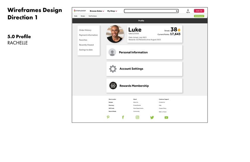
next came designing the wireframes for our site pages. I created some sketches before digitally constructing them and included annotations for each one. Here, we wound up breaking up our statistics page into profile and statistics pages. I sketched for this new profile page yet didn't create a digital wireframe for it as we changed our minds soon after.
wireframe sketches:


digital wireframes:


we now had to create more detailed and practical mockups of our page designs. Everyone was asked to go in two different directions so we would have multiple options to pick from when giving our presentation to the class.
design direction #1: home, leaderboard, profile:


design direction #2: home, leaderboard, profile:


I also created a header we wound up using for later versions of our home page design:

after our critique, we chose Anna's direction to go in and redesigned our pages accordingly.
we decided to change our persona and only used one from here on out. Victoria was the name of our new persona outlined below. Anna created and wrote this persona for us to use:
Primary Persona
Name: Victoria
Age: 20
Occupation: Full time college student, student Athlete
Goals
Save money whenever possible
Complete tasks efficiently
Find greater satisfaction in chores
Utilize her competitive nature to keep her engaged
Challenges
Lack of time to go shopping in store
No transportation to the grocery store as a dorming student
Weekly grocery shopping gets repetitive and boring
Limited budget
Victoria has little time, no car, and is bored with her chores. STOP&SHOP’s Go Rewards enables her to order her groceries online and have fun completing quests. Victoria’s competitive nature keeps her fighting for the top of the point Leaderboard, while also earning savings that allow her to stretch her budget.
when going forward with the leaderboard design, we were told to use our own imagery instead of stock photos, so we gathered images of our friends and people we knew for me to use.
final designs (so far):


we also tried another version of the header as the black text was very bold and jarring. We tried an option with a lighter gray first:

in critique, we were suggested to create a more food-oriented design considering this is a grocery store's website. Promoting our rewards program was important but sticking to the food aspect was more important. We came up with a new idea and I put the plan into motion.
final header:

I created this header but gathering imagery of small fruits and nuts, cut them out, and arranged them in the shape of a smile. I used the brush tool on photoshop to add shading and shadows to make them look more authentic and establish a light source.
after further critique in class, I made some final changes to the profile and leaderboard pages.
final profile design:

we decided the profile page needed to display more information. The buttons used prior just led the user to another page and didn't really explain any information that the profile was offering. We also brought back some aspects from out statistics page and added a stats section at the bottom. We ultimately wanted the profile to contain more information and serve the user in a more direct way.
final leaderboard design:

we decided to add a ribbon icon to emphasize the first place user and I added a friends leaderboard to make the "add friends" section more useful in this page. While Victoria is placed at #24, I added her to the bottom of both leaderboards to signify her current position in relation to other users.
I then redesigned the wireframes to match the current designs.
final wireframe: profile

final wireframe: leaderboard

marcello compiled our designs into our final presentation:


Comments