iphone app: Groove
- Rachelle Vassoler
- Dec 13, 2023
- 3 min read

for this assignment, we were asked to design an iphone app for an essential service in the NJ or NYC area. The service should be something the user needs to better the experience they're looking for. It should act as a helpful tool for users.
for my app, I decided to create a social media/map system that alerts users of upcoming msuic shows from local, underground artists. I named my app Groove, as it's used as a way to keep users "in the groove" and stay up to date with music shows.
Groove allows fans of local artists to find out when and where new gigs are taking place. Musicians and venue owners can post the information of an upcoming show, where it will be added to the map and show up as reccomendations on a users home and search screens. Like typical social media, fans can follow an artist or venue they enjoy and recieve immediate updates about their next show in the feed on the home screen. The map screen highlights all the hot spots in the surrounding area where shows are taking place. Users can tap a highlighted spot to gain more information about the event. The goal is to provide one spot where people can discover new artists and allow smaller artists to promote themselves and gain a wider audience. Groove creates and solidifies a community of artists among one another.
to get started, we were first asked to create sketches of our app's screens that demostrated the typical user flow. We were to envision a persona or personas that would benefit from this app while designing in the first stage.
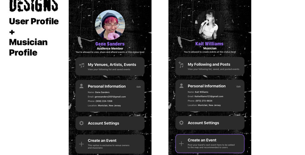
I created a home screen that would display events in chronological order from when they were posted. Artists and venues the user follows would show up as well as newly posted events in the surrounding area. A search screen would allow users to search for artists, events, and venues manually. They can view recommended events as well as explore different music generes. The map screen highlights areas where an event was posted and allows the user to visually see where the event is located. The profile screen allows user to review personal information and view their following.


I then created a promotional poster, communicating the desried aesthetic, using colors, fonts, patterns, or designs that would appear in digitized screens. I hand drew the writing featured at the top of my poster.
initial poster design with sketches:


after creating a poster and sketches, I digitized my screens with two design directions. I experimented with adding a seperate screen for adding events but later changed that idea.
design direction one and two seen on the home and search screens:


home screen v1 search v1 homescreen v2 search v2
other screens with design direction one:


launch screen event details add event map
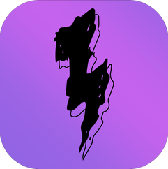
Besides screens, I created an icon to go along with my app. I carried the design from my poster into the form of an icon, using the lightning bolt shape from the "R" to create a visual icon.
initial icon designs:


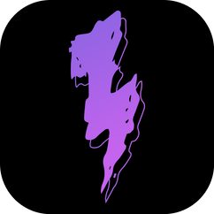
icon design, varying sizes and screen mock-ups:

after receiving critique, I continued with my first direction and revised my pages as needed. I created two personas for my concept to better construct my screens and establish a clear user flow. One, a user looking to find music shows to attend and another, a musician looking to expand the auidence for their band.
persona 1 and persona 2:


I compiled my final designs into a presentation:


all final screens:


user flow: persona 1:
user flow: persona 2:


Comments