type and image sequence
- Rachelle Vassoler
- Jun 8, 2023
- 2 min read

for this assignment, we were to combine type and imagery into a six spread accordion booklet to accompany the text "Design: Form, Purpose, and Meaning" by John F. Pile. Throughout our design, we were to manipulate a single photograph of one object of our choosing. All imagery would be in black and white with a single spot color of our choice.
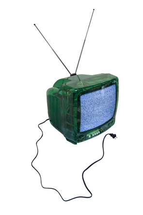
I first started by photographic the object I wanted to use, an old CRT television.


I then took the provided text and dissected it into six parts for the six spreads, making note of any important words or phrases along the way


we were then asked to create sketches of two possible directions for our spreads. these would be presented as one continuous scroll.

after sketching, I began preparing my imagery for digitizing. I cut out anything I found useful in executing my concepts. I originally used my full color images to figure out layouts and text configurations. After deciding on

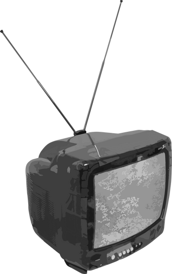
placements, I applied gradient maps, duotones, image tracing, and other filters to my cut outs. For my one spot color, I chose a similar green to the tv and applied it to text and imagery when necessary.
spot color:
some edited imagery:


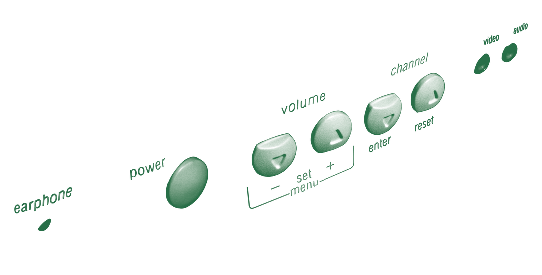


I then started placing my unedited cut outs into the file to get a good idea of composition and arrangement before the editing process. I wanted to know which elements I would definitely use before editing anything unnecessary.
first examples:


once I placed everything in, I began the editing process on my images, replaced existing imagery, and added anything I felt was necessary.
second examples:


I continued to move text, add my spot color to key words and phrases, and make other adjustments until I felt I was finished.
for my title page, I wanted to create a border similar to that of an old tv with the title information inside.
sketches:

I originally planned to project the text through the tv itself and photograph the screen, but I felt it contrasted too much with the rest of the booklet. I still used the shape of the screen as the border, cut out the center, and typed the text directly into the document
original concept vs final:


I added the final title page and the booklet was finished
final booklet as scroll:

final booklet:


Comments