spotlight
- Rachelle Vassoler
- Apr 11, 2023
- 5 min read

Updated: May 11, 2023
for this assignment we were asked to work in a group to create a trifold invitation to a fiction exhibit for a graphic design luminary of our choosing. We were asked to showcase their work and achievements and had the option to add additional collateral designs.
We were to create a trifold informational pamphlet while only using 2 PMS colors.
Once again, I took on the role of group leader and was responsible for assigning tasks to my group members. First, we started gathering basic research of luminaries we were thinking of using. As a group, we came to the conclusion to center our project around graphic designer April Greiman.
We were asked to generate three questions that would help jumpstart us to gather specific research. Because my group consists of three people including myself, we each came up with a leading question and based our personal research off of it.
To what extent was Greiman inspired by other designers? -Arjin
What challenges did Greiman face working with digital and analog media in a time where digital work was just emerging? -Byron
How did Greiman’s work impact and influence the graphic design industry? -Rachelle
I then instructed my group to gather as much research as possible not only so we could have a better understanding of our luminary, but also so we had text ready to place in our trifold once we began designing.
we kept a shared google doc with all of our text and visual research to look over at any given time.
personal research:


group research:


visual research:


after conducting our own visual and text research, we needed to decide on a color palette. Greiman's work utilizes intense colors so we felt two bright, bold colors with good contrast would be good for this assignment. We tested out some color palettes with duotones and our chosen imagery:

we decided the middle color palette of blue and pink would work best for our design. As much as the bright cyan, yellow, and magenta reflected Greiman's work, we felt a softer pink with a bold blue would provide good contrast when creating duotones and our overall layout.

now that we had visual research, text research, and our chosen colors, we needed a name for our exhibit. Greiman's work emerged in a time where digital design was unheard of. Everything was done by hand and she was one of the first to use the digital tools of a Mac in the graphic design industry. She soon became involved in the new wave movement and was referred to as "The Queen of New Wave". We felt this would be a good title for our exhibit as it summed up her history and was an empowering way to refer to her as.
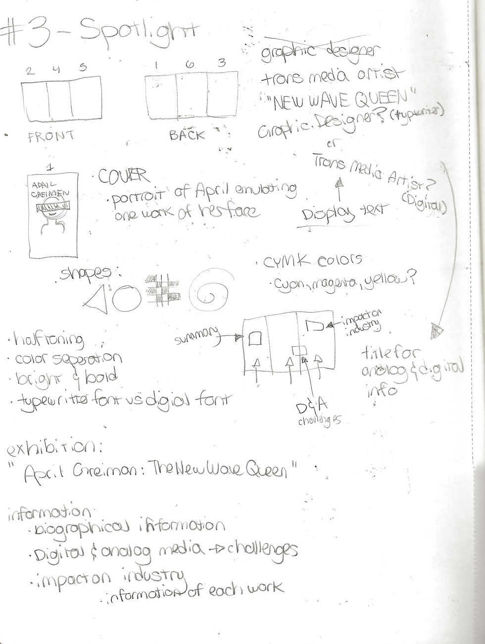
we than began brainstorming as a group about what information we wanted to include. I created a brainstorming map and had my group write ideas down that we felt would fit in our trifold.

after having a general idea for our type, we started talking about design elements we wanted to include and who would work on what. Greiman's style is very unique and distinct so we wanted to create a design that honored her work without becoming too cluttered. We made use of collaging our elements and giving our type a cut paper feel by adding a white background with a typewriter font. We made note of certain figures and shapes Greiman used, such as the swirl on our front cover, the 3D and 2D shapes scattered about the inside and outside of our design, halftones, and dither gradients. We researched certain design movements such as Swiss punk, west coast postmodernism, Memphis style, and of course, New Wave graphic design.
In our visual research, we found examples of magazine spread designs other people had created in dedication of Greiman. We referenced their design choices and type treatments and used it as inspiration. We then created some sketches and notes for possible designs:
as for graphics, I was tasked with creating an image for our cover panel, I took inspiration from Greiman's cover for Wet magazine and made use of halftones, duotones, gradients, and shapes for my design:

I wanted to add a dither gradient to the background. Greiman's work is a combination of both digital and analogue collage techniques, so I felt having that pixel-like graphic would fit well. I used this same gradient as the background of the inner portion of the trifold.


I handled some of the text on the front cover and inside of the trifold as well. Here, I experimented with warping the text, a trait seen in some of Greiman's work.
Greiman's work: my type:


I also created a sketch we could follow when building our inner pages:

I then created a file that we could all work off of when designing. I handed this file off to my group members and gave everyone the opportunity to add to it. I worked on revising any panels and making changes to any elements that needed it. Any changes I made I went over with my group first and were agreed upon. I tried splitting the work up as evenly as possible, with each of us working on about two panels each and adding revisions throughout.
arjin: front and back of trifold:


byron: front and back of trifold:


once receiving the files my group members added onto, I talked about rearranging and changing certain design choices while keeping some of what was added. I then had them provide finalized paragraphs of research text to be inserted. I spent time revising and adding their text and mine to the inside. This made it easier to cut down anything unnecessary and to do final changes all at once.
rachelle: front and back of trifold:


I presented my final edits to the group and we discussed any more changes we wanted to be made. I handed the file off one more time so they could make any edits. After this, we were finished:
inside of trifold:

back side of trifold:

we then printed out our final in class and folded it up:
something not seen in our flat files is the large image that appears when the cover is unfolded. We used it as a way to include one of her works on a larger scale and to make use of the space in a dynamic way.


collateral design:
In addition to the trifold, we had the opportunity to create collateral designs such as a t-shirt, mug, or vented banner. Because we have three group members, we each decided to design our own item. This gave us all the chance to show our abilities and see our own styles within the project.
I decided to design a t-shirt. I wanted to use the same cover graphic I designed previously as it would tie in our trifold and create consistency. I wanted to create a typographic design for the front pocket and a big graphic image on the back. I wanted to reference Swiss type design, as it's where Greiman's early inspiration first came from. I gathered some visual research and made up a sketch.
visual research:


sketch:

I started by working on the collaged graphic for the back of the t-shirt. I remember being told in critique my addition to the cover would work good if used in a collage, so I went in that direction:

I used graphic elements seen throughout our design and some of my own. I made use of more halftones and grabbed the eye image from one of her works. I included her name and the exhibition name on the back.
for the front design, I wanted to create something that typographically reflected the Swiss typography Greiman was influenced by. The dramatic scaling of text turned simple type into a design while representing her history:

I took both my designs and presented them on a mock up:


Comments