read, unpack, recast
- Rachelle Vassoler
- Mar 14, 2023
- 6 min read

Updated: Apr 9, 2023
for this assignment, we were asked to work in a group to interpret a randomly selected passage from a novel or poetry book. We were instructed to deeply analyze each aspect of the author's words, considering every possible meaning for phrases, metaphors, and word choices. Then, we would create an eight page booklet in response to our interpretation featuring our entire passage along with accompanying visuals.
while we had complete freedom with imagery and typeface, we were required to stick to a three color PMS palette. We could utilize tools such as gradient mapping and duotones as a way to stick to our colors. We could also change the opacity of these colors as well. We were required to conduct our own research and converse with our group throughout the first part of this process. Once we had a clear interpretation we agreed upon, we could move onto the design process.
We received the poem "The End of Autumn" by Francis Ponge:
All of autumn, in the end, is nothing but a cold infusion. Dead
leaves of every sort steep in the rain. No fermentation, no
production of alcohol: we'll have to wait until spring to judge the
effects of a cold compress on a wooden leg.
Sorting the ballots is a disorderly procedure. All the doors of the
polling place slam open and shut. Throw it out! Throw it all out!
Nature rips up her manuscripts, demolishes her bookshelves,
furiously clubs down her last fruit.
Then she abruptly gets up from her work table. She suddenly
seems immense: hatless, head in the fog. Swinging her arms, she
rapturously breathes in the icy, intellectually clarifying wind. Days
are short, night falls fast; there's no time for comedy.
The earth, in the stratosphere with the other heavenly bodies,
looks serious again. The lit up part is narrower, encroached on by
valleys of shadow. Its shoes, like a tramp's, soak up water and make
music.
In this frog-farm, this salubrious amphibiguity, everything
regains strength, leaps from stone to stone, changes pasture.
Streams proliferate.
This is what's called a good clean-up, with no respect for
convention! Dressed or naked, soaked to the marrow.
And it doesn't dry up right away, it goes on and on. Three
months of salutary reflection with no bathrobe, or loofah, no
vascular reaction. But its sturdy constitution resists.
After thoroughly reading, analyzing, and defining the words, phrases, and sentences of our poem, we decided to write our own interpretations and then talk as a group. We came together and talked about what the author was trying to say through his words. This particular poem used a lot of metaphors and interesting phrases that were a bit of a struggle to decode. Once we came together, we found it easier to understand and came to an agreement on what our poem was about:
The End of Autumn can be described as a metaphorical representation about the changing of seasons from the warm start of autumn to its cold ending. Ponge uses metaphors in combination with a heavy personification of Mother Nature to represent these environmental changes. We are taken through the destruction of leaves and plants in the form of bookshelves being torn down to the coldness of the weather in the form of a stressed and tired mother Nature. This theme of metaphors is the basis of Ponge's sentence and phrase choices. We are taken through an almost cyclical journey of the changing of seasons in the form of personification and metaphor.
to help us further our interpretation, we created a list of vocabulary words we had trouble with:
Encroached: intruded
Salutary: beneficial
Immense: large or massive
Rapturously: in a way that expresses extreme pleasure or enthusiasm
Salubrious: healthy
Proliferate: increase rapidly in numbers, multiply
we then conducted our own research on topics that stuck out to us or we felt were important in our poem, I chose to research Mother Nature as her personification in the poem plays a big part in it. I wanted to learn more about the role she plays in other media and if this information could help us visually represent her better. I also researched frogs as they are mentioned towards the end of the poem along side the words "regaining strength". This caught my attention as it seemed like they had a deeper metaphorical meaning and I wanted to explore that more.
personal research:


group document of research and findings:


after conducting our own research and having a clear understanding of our poem, we came together and starting brainstorming a direction to go in with our design. We sketched out general ideas and came up with a plan for the imagery in each panel.
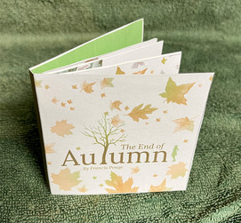
We decided to keep the size of 3.25 x 3.25 for each panel and divided the seven stanzas of our poem into eight pages. In deciding what to put on each panel, we heavily followed key words, that way the imagery could accurately reflect the parts of the poem it represented.


as a group, we decided we wanted to use imagery we shot along with found imagery online to represent our interpretation. One of my group members provided a resource where we could use stock imagery for our project. They also provided me with imagery of their own we could use. Before constructing our design, we chose our color palette and my group members made a visual research board.
visual research: color palette:


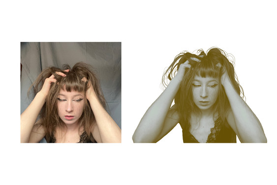
because we needed to stick to this color palette, we utilized duotones and gradient mapping as a way to incorporate our photographed and found imagery. We decided I would represent mother nature in our project, so I shot some images of myself and edited them using duotones or tritones of our chosen colors.


when designing our booklet, we wanted to create a cohesive image that blends along the eight pages. We went in this direction as we wanted to represent the transition of season changing with a graphic that evens blends from page to page and lines up evenly.

we started adding elements we put together or shot and applied gradient maps or duotones to them.
one of my group members found a source for online imagery:
we wanted to have a mother nature figure appear first in our design, followed by a swirling of leaves coming from a tree that turned into loose sheets of paper. This would represent Mother Nature's powers when it came to the environment's changes in autumn. This also directly related the metaphor of "sorting the ballots". We introduced an image of a bookshelf to continue sticking to the next line in the poem.
After placing my image in the first panel, I created the grassy land next to my face by cutting from an image and pasting the pieces together, I then used a gradient map with one of our colors to make everything cohesive
original imagery: cut collage:


final edit with gradient map:
Because I was tasked with either creating or placing some graphics, I drew some imagery for the paper in illustrator and applied duotones to them
before: after:


with imagery either provided by my group members or found online, I continued using the same methods:


we placed another image of a stressed and disheveled Mother Nature followed by a mountainous valley, continuing with key words in our poem. We created the valley here by cutting from found imagery and creating a collage, similar to the one in the second panel. Again, we applied a gradient map. We were particularly interested in the mentioning of "frog farm" and Ponge's construction of the word "amphibiguity". We were told three frogs was too many but you can never have too many frogs, so we still used three.

found imagery with duotones:


The last two stanzas talk about "a good clean up" this continues with the words "bathrobe" and "loofah". We used imagery of a shower to represent these metaphors and carried over raindrops from the seventh panel into the eighth. I drew the raindrops in illustrator and scattered them throughout the panels.


when it came to text, I assigned one of my group members to go about designing the layout. We agreed upon a font and they sent me the files once the poem was typed up.
prepared text:


We wanted to have a cut paper look for most of our text while using type on a path in certain panels.


because our chosen colors didn't stand out enough for the text, we used a duotone to create the brown color seen here.
when creating the cover, we decided on an image for the back and a designed graphic for the front. One of my group members provided the image on the back which I converted with a duotone while the other worked on the design for the front. While I tweaked some design elements on the front, the text treatment and imagery is theirs.
original image: edit for back cover:


original file: final cover:


after completing any edits, I consulted with my group members on any changes or design adjustments we felt were necessary. Next, my group members prepared the files for print.
finished cover:

finished pages:


I then printed out our cover and pages and assembled the final booklet


final files of spread:


Comments