onomatopoeic word
- Rachelle Vassoler
- Apr 5, 2023
- 6 min read

for this assignment, we blindly chose an onomatopoeic word and were asked to understand and know it well. We were encouraged to explore its connotative and denotative meanings. We were expected to fully examine it, knowing it as deeply as possible. My word was toot
questions to consider:
How do vowels and consonants relate to each other?
Are there any repeated characters/letterforms?
Which characters appear more than once?
How would you describe the characters that spell your word?
What images come to mind when you see and sound your word?
we could chose between two fonts, garamond or univers, and could only use our word when creating sketches. The use of size, weight, spacing, placement, repetition, etc. were encouraged to force the characters to perform the sound of our word.
Phase I:
for phase 1, we were to understand our word through conducting research and create 15 sketches using the font we chose
Work with pencil or black pen on paper. No computer work.
Univers or Garamond. (Regular weights only – do not use bold, italic, or other weights.)
Upper- and lowercase characters may be used. Conventional use of U&lc. may be ignored.
Black and white/graphite and white only.
2 x 2-inch square format featuring 8 x 8 modular grid.
I started by researching basic definitions of my word and wrote down descriptive phrases that stood out to me. I made some notes on how I would describe my word and then made some letterform sketches.
descriptions I kept in mind:
sharp, sudden sound
crescendo
an explosion of letters
being blurted out
as if being "thrown" in one direction
increase in sound, maybe increase in letterforms
sketchbook:
I printed out my letterforms to reference when rendering them. I practiced them here to aim for accuracy to my typeface in my physical sketches.


sketches:

when sketching, I thought of the blurting, sudden sharp sound of a toot from a horn. I thought of possible exaggerations of the two letter o's and how I could visualize the stumbling about of a loud noise only through black and white letters. I made use of size, rotation, and scale when placing my letters and went back and forth on the idea of an uppercase or lowercase format.
from all my sketches, I enjoyed the compositions I created from these three. The one larger letter "o", arching form, and increase in size was a common theme I found from all my sketches and was something I stuck too when creating my digitized design.


I digitally created more concepts as I wanted to see what a cleaner example would look like compared to my sketches. I created four versions of my design and compared them before deciding on a final.
digitized concepts:


final:

I chose this design because of it's arching form, increase in letter sizes, and the exaggeration of the one letter "o". While I came to a block and struggled visualizing my word effectively, I felt my design still reflected the themes I discovered when researching my word.
Phase II:
for phase 2, we were asked to pair our first word with an obliquely (indirectly) related second word. This word would loosely be connected to our first word through either of the listed principles:
Metaphor
Irony
Simile
Analogy
Pun
we were to create 7+ more layouts of our onomatopoeic word and descriptive word together. The idea of reconfiguring our first word was an option, yet we had to lay our second word horizontally, like normal type. No rotating, stacking, or type on a path were allowed.
I started by taking notes and digging deeper on my word's meaning as well as possible secondary words that could loosely relate to it.


I first started by exploring the terms of instrumental horns and other brass instruments. As a toot is a sound that directly comes from a horn, I tried writing down words that suggested my word instead of directly relating to it. I created a word list and tried to pick out words with a strong connection. I then created a word list to fit all my possible selections into.
research:


I related the word horn to that of an animal horn and conducted research on any deeper meanings I could find. Animals use their horns as a type of protection and weapon when fighting, so I tried adding words that could be fit to the list.
I also researched the significance of instrumental horns and the meaning of a single toot coming from one. The blow of a horn commonly would represent a change in events. Grabbing the attention of an audience or representing the start or end of something, a single toot reflected an overall change. Horns were used in battle, signifying its start or end. The blow of a horn also had religious context as well, representing many events in the bible as well as in Judaism. The start of a celebration, going into war, gaining the attention of God's people, and the ascension of God himself. A single toot held authority over others and high importance.
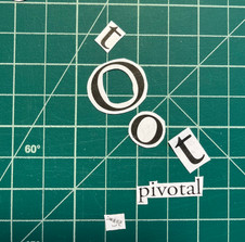
during critique, my list was narrowed down and I decided on the word "pivotal" as my oblique word. Pivotal, meaning of vital importance, is a moment in time where the course of events abruptly changes or pivots. Signifying importance and change, I felt this word best described the cause and effects of a single toot. It was still oblique enough to work while having a strong connection.
I then created some sketches of my words together:

I started with some variations with my phase 1 final and then branched into other possibilities.


I found myself repeating the same arch when combining both my words. For my final, I wound up adjusting the space on my phase 1 design and adding my second word below it.
final:

Phase III:
for phase 3, we were now asked to add a third element, an image as a square or rectangular object to our composition. Being a level three element, it would be the smallest part of our final layout. we were to present at least three different images and think obliquely when shooting.
we were to create 4+ sketches of our first and second word paired with our chosen image. We could reconfigure our composition but only draw out any ideas we had.
I started by writing some notes down about my two words and created some sketches for image possibilities


for imagery, I originally wanted to capture the religious connotation for my word pairing. I thought that an image of rays coming down from the clouds could represent that pivotal moment in a religious context. The street light imagery had kind of the same premise, so I wasn't too confident in that one. The one way sign would represent that change of direction I was trying to capture in a more literal sense.
possible imagery:


I created a test for what I thought was my strongest image with compositions I had sketched out.


overall, I felt my ideas here were lacking. Through critique, I began to shift towards the sense of authority and importance implied in my research. I found that the blowing of a horn was usually done by someone of high importance or an authority figure. The ability to turn the direction of a whole crowd of people signifies this authoritarian power of an individual and of the action itself. There was this sense of standing out or higher importance from the rest of a crowd I wanted to explore visually.
visual research:

I researched simple photography representing my idea and "The Weather Project" by Dan Friedman for more ideas on type treatment. I then photographed some images reflecting my research and ideas.


before creating anymore digitized layouts, I printed out my letters and tried manipulating them physically to come up with a stronger composition. I was struggling to create something successful just by sketching or using the computer, so working like this helped a lot.


I found some arrangements I thought worked well, so I picked my favorites and moved onto digitizing them.

digital concepts:


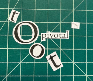
when choosing my image for my final, I chose the buttons. I felt their shapes were more identifiable from a distance considering how small I needed my image to be. The tomatoes were harder to distinguish and I felt there was more color contrast with the buttons. I tried this concept with different objects, but I felt the buttons were the most successful.
I changed my layout from phase 2 as I realized my second word not only needed to be much smaller but that the composition wasn't as successful with an image placed next to it. I kept my idea of arching text and exaggerated letterforms with my first word and just adjusted the tracking with my second word.
final:


Comments