let stand, or just add water
- Rachelle Vassoler
- May 9, 2023
- 5 min read

for this assignment, we were asked to design a package and company mark for one fictional product from a given list:
footwear
heavy machinery
farm animal
transportation
we were also given a scenario for this project:
The year is 2039 and shopping for goods and commodities has never been easier. Nearly everything can be shelved and stacked. What’s life-size or larger is sold at near pocket-size and livestock are placed in suspended animation. This is a world in which conventional notions of scale and proportion are negotiable, animal ethics included. In this age, miniaturized products must be restored to “operational capacity” (i.e., watered or exposed to the elements) prior to use.
While miniaturization is radical, 2039 is a cold, gray, post-post-pandemic world. People are deadpan and insufferably practical.
Approached by an unusual (by 2039 standards) client who aspires to stand out, you’ve decided to explore humor, surprise, and playfulness as design languages. “Wittiness”, you think to yourself, “will change everything.”
we were allowed to use 3 PMS colors and color screening
instantly, I became inspired by the magic grow capsules that slowly transform into an animal when placed in water. This led me to create an idea of a grow capsule that turns into a farm animal when placed in water. With the concepts of environmental awareness and sustainability already on the rise today , I figured I could market synthetic livestock as an eco-friendly alternative to a world experiencing a shortage of typical livestock. Focusing on sustainability, this product would push the idea of individual farming as part of a new eco-friendly fad people were interested in. A goal would be pushing the idea of easy, small-scale farming that could be carried out in an easy and accessible day. Each capsule would contain one farm animal that when placed in a bath of water and exposed to the sun, would grow to a full-size, exact replica of a livestock animal. Each animal would be a synthetic biodegradable copy of its real life counterpart, known for being healthier for people and the environment. Its bi-products would taste and look exactly the same as the real thing, be healthier, and leave no damageable waste for the earth.
sketchbook pages with notes:


To help build and solidify my idea, I began conducting some research on sustainability, dystopian worlds, and eco-friendly packaging
text research:


through research, I became invested in the idea of a sustainable dystopia, an exaggeration of typical sustainability where limits are pushed into an almost disturbing level of eco-friendliness. I wanted to play into the idea of something aggressively eco-friendly to where it becomes unsettling and questions the idea of ethics and morals. To convey this through my design, I researched greenwashing in package design and the packaging of seemingly sustainable products. This product needed to look and feel as convincing as possible to a potential buyer
visual research:


I focused on very minimal designs with flat colors, fine lines, and basic shapes. Minimalism is very common in the graphic design world now and I felt that direction would also fit in with the futuristic sustainable design I was leaning towards. I kept in mind the brown and green color scheme of eco-friendly products when designing as well. When thinking of a company logo, I looked up generic examples and used them as a guide. I created some sketches to get started.

I started with basic word plays and tried to visualize my ideas. I then began to digitize my concept to get started with my package.

while I thought this was a decent start, I felt my design was lacking and needed some changes, especially when trying to fit my logo into the package dimensions. I was also stuck on creating a good, believable name for my product so I created word lists based on environmental and agricultural terms

I enjoyed the "agro" word I was using beforehand but needed it to sound believable when paired with something else. Considering my product grows in water and is a form of agriculture, I thought the spelling "agrow culture" a play on the word agriculture, would be funny yet believable. I ran with this idea and started redesigning.

I wanted a thick, slab serifed font for my logo so it would contrast with the thin text I was planning for the rest of my type. I started off by designing the front panel to get a good sense of aesthetics and flow of the design.
at the bottom, I decided to create a mark that would certify the eco-friendliness I wanted to convey. I was inspired by the vegan mark seen on real products and the overuse of words like "all natural" and "pure" commonly seen in greenwashing. I created phrases and words that solidified my idea and helped build a believable brand.

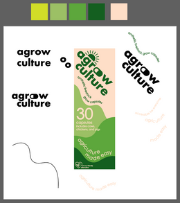


I stuck to the green color palette from earlier and created fields with flowing shapes. My goal was to have these fields to continue around the package in a seamless design. I made use of a thin font and type on a path to flow with the form of my shapes.
color palette:
I didn't even realize I used four colors until after I was completely finished, I'm now considering it an artistic choice.

I created some sketches before moving onto the rest of my package

once my panels were setup, I started placing my text and adding any imagery I wanted to include. I wanted images of the livestock included in the package as I felt a design with purely text wouldn't be engaging enough. I created some physical sketches and digitized them in illustrator.
panels:

sketches: vector images:


progress:

I then did a test print to see how my design looked in person


I realized the ordering of my panels needed to be changed. I didn't like how all of my informative text was on the side and a simple graphic being on the back. Because of my continuous design around the box, I couldn't just move each panel around, I needed to redo the format of my type for each panel. I liked the organization of text on my informative panel and didn't want to change it, so I realized I would need to recreate the type on my front and one side panel. The bodies of each animal being split between two sides also ran me into some issues too. In the end, I redesigned my front and side panels.
redesign:

for my back panel, I created an informative summary describing my product in detail. This helped make my product seem more authentic and helped reinforce my narrative.
once finished, I printed again to test if my changes were successful


I then added some color and a graphic to the bottom and top of my packaging before my final print in class.

I printed for the last time in class and my project was finished.


Comments