currency as cultural icon
- Rachelle Vassoler
- May 30, 2023
- 3 min read
for this assignment, we we asked to recreate a currency system for a country of our choice aiming to provide a better understanding of the cultural heritage and ethnic background of said country. We were to redesign three bills, front and back, using their current system of denominations.
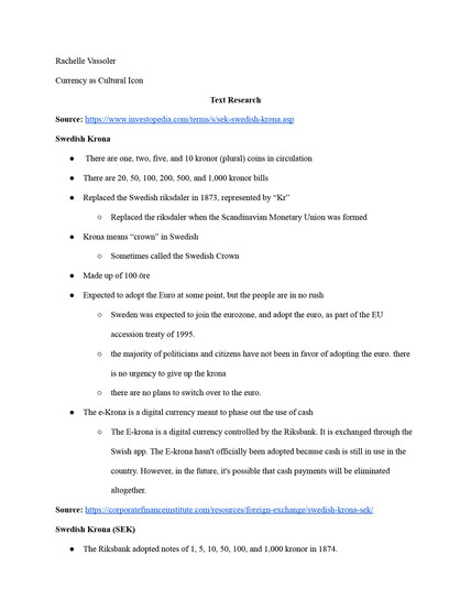
we were asked to conduct research, create a word list, and an image matrix before starting any sketches
I chose to redesign Sweden's currency
research:
before collecting images, we were asked to create a word list of terms relating to our county while highlighting the ones we felt were most relevant.
we kept in mind symbol, Icon, and Index while collecting images and eventually placed them in a five by five grid called a matrix. we used the matrix to help gather relatable and accurate elements to use later when designing our poster. I first placed images in the center row of the grid, with more personal representations on the left and universal ones on the right. From this row, we focused on the shapes and forms of these images and placed more elaborate representations going up and more simple ones going down.
word list and matrix:
original currency:

after gathering enough research, I made some sketches for each bill. my goal was to capture a broad representation of Sweden's culture and people, so each bill would contain different imagery while begin tied together by that cultural aspect.
for the first bill, the 20 Kronor, I wanted to capture a simple, surface level understanding of the culture through imagery of food, traditional costume, and important holidays. I would include these images on the front while showing an aerial view of the capital, Stockholm on the back.
for the second bill, the 50 Kronor, I wanted to reference the innovative aspects of Sweden. they are known to be a very innovative country, and I felt this would be a good quality to highlight through their currency. Imagery of a viking ship and a Volvo car on the front would represent innovation from past to present along with a blueprint graphic in the background. the backside would be an aerial view of Gothenburg, the city in which Volvo was founded in.
for the last bill, the 100 Kronor, I wanted to provide representation of their indigenous people and what part of Sweden they reside in. the Sami people of Scandinavia still exist today, living in the northern Lapland, herding reindeer. the back would show an image of the northern lights from the area they reside in.
All three of my ideas would act as a way to provide a basic representation of greatly different aspect of the country while still sharing a connected theme.
sketches:
after critique, I revised my sketches and then began digitizing:

to keep my designs more consistent, I kept all important imagery on the front and would include landmarks on the back instead. my concepts for the 20 and 100 kronors stayed relatively the same. For the 50 Kronor, I focused more on the viking ship and other innovations rather then the car. While Sweden is responsible for inventing bluetooth, Spotify, Skype, and Karma(app), it was best to include something not associated with a business or logo. I decided to included a zipper on the front, a Swedish invention. For the back, I used an image of the Baltic coast, an area vikings would commonly sail on.
I selected a color palette for each bill and manipulated imagery with gradient maps, duotones, and color filters.
color palette:

first bills side by side:

after receiving critique, I revised my designs.
revised color palette:

revised bills:

after this, my designs were complete.
final bills:


Comments